Getting Inspired from The House For Hope
You can’t walk through just one room of the House For Hope and not be amazed at the design, colors, or finishes infused into this home. Getting inspired from the House For Hope can be found in even the smallest of details whether it’s leaves in a vase or a side table in the Master Bath.
This is a it long, and contains several pictures, all for your enjoyment. And encouragement.
To begin – the colors which were chosen by Kristie Barnett, The Decorologist, are all from Sherwin Williams. These were given to each designer to be used so the house would flow, but as you walk through each room they added their own flair. You may see a navy blue or blush pink added to the core colors, but there is such a flow from room to room, you don’t realize you are walking into another room.
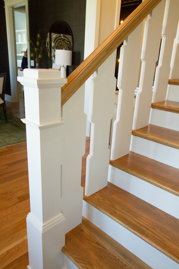
As soon as you step into the entry, you know it’s gonna be full of great design. I loved these ballisters, not your typical poles. Just another indication of the custom work designed by Chad James Group.
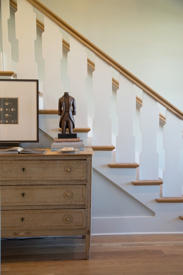
And using a small chest, great for stashing your purse or mail as you enter just adds function along with style. I love the masculine look to this.
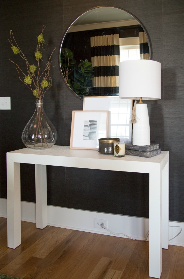
Directly to the left is the magnificent dining room by Redo Home + Design Team. The walls are covered in rich black, lacquered grass cloth for a touch of luxury.
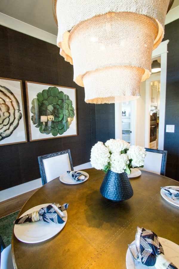
As with the modern look to this room, adding this coco bead chandelier gave it just a softer touch. All of the light fixtures is worth a visit to see them.
Just across the entry hall was the study by Trot Home. I noticed the simple styling of the built-in shelves, filled with both vintage and newer items. Again, a way to use a few things you have collected over the years. Antique bowling pins are now on my “look for” list.
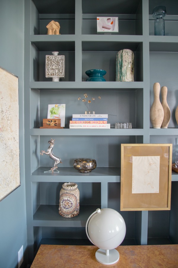
Not only was the design outstanding, but the technology provided in the kitchen designed by Lucy’s Inspired would make life easier. The Electronic Express made it truly a Modern Farmhouse with the appliances. I need a new refrigerator with a Keurig built in, and Wi-Fi. Think of the counter space saved. Oh, and you can make your coffee while still in bed – sounds like heaven.
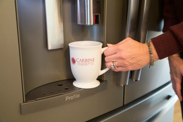
Another great feature was the vintage barn style door opening to a display area of pottery. I love these farmhouse style touches and how it blends into the more modern kitchen but it still works together. What a wonderful space for a your collection, or maybe vintage cookbooks.
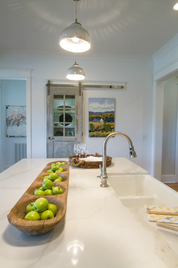
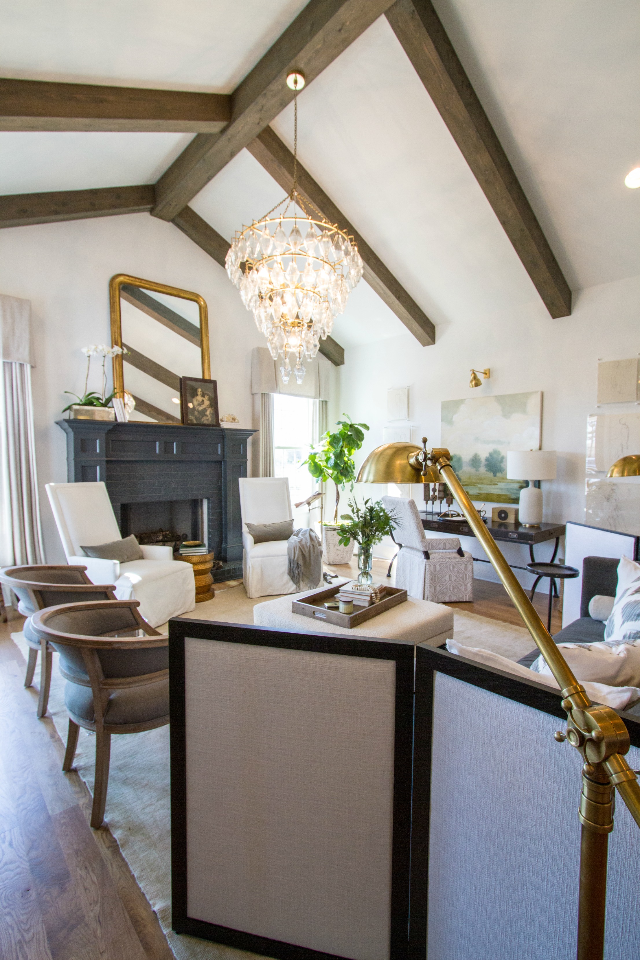
One of my favorite spaces was the living area which was open from the kitchen. I have talked myself out of painting my fireplace several times, but now after seeing this one – I think it will be done. And maybe even in this same Iron Ore color. When you think of a black fireplace, you may think it would create a black hole but this being that softer black, was just right. Hats off to Julie Couch Interiors.
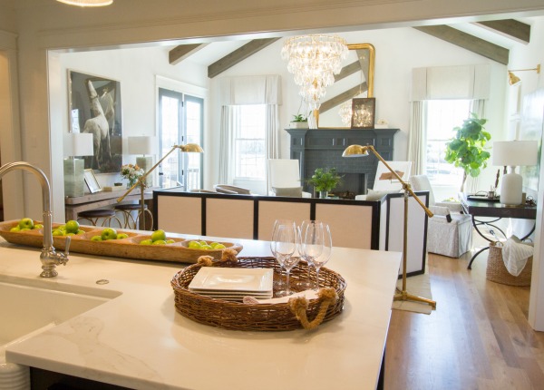
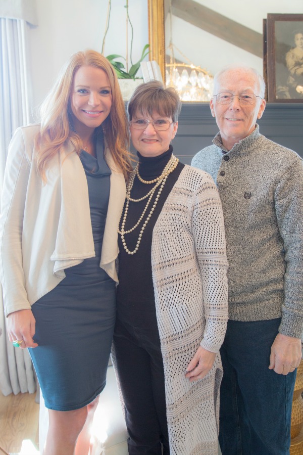
I had the pleasure of meeting Julie, who you may recognize from Nashville Flipped. Oh and my dear hubby Don tagged along for the day to meet some of these people I talk about all the time. Plus he’s not as shocked at the “black” I want to use.
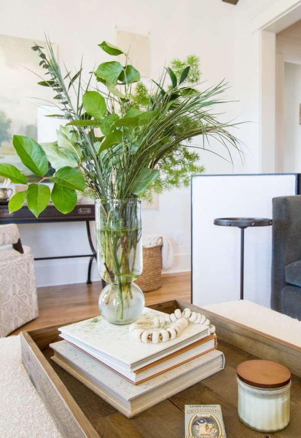
A simple idea of just adding a few springs of greenery in a clear vase on the coffee table adds a little pop of color. Go out to your own yard to pick a few to add this simple, but lovely touch.
Oh, and the chandelier – it’s hard to say enough about this space.
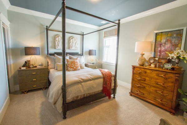
Remember the Iron Ore, well another place it was used was on the ceiling of the guest bedroom by Peddlers Interiors. A black ceiling? YES!! (sorry if this appears a bit blue) Remember, it’s a softer black and it made the ceiling stand out. You may think the dark color would make your ceiling appear lower, but believe me, it doesn’t. Another project to try – maybe the dining room. I’ll keep you posted.
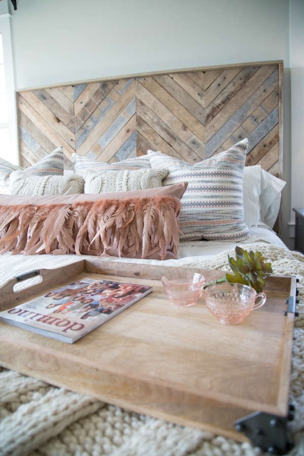
The headboard in the Master Bedroom, by Refresh Home, could be a DIY project with just a few tools and a little time. That feather pillow – swooning over it.
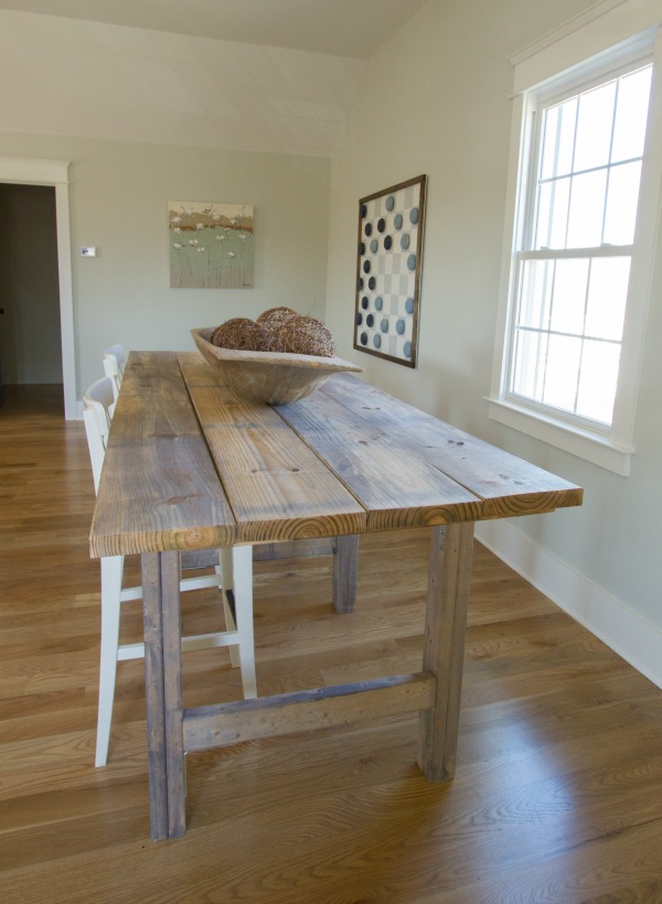
The family game room was a large area with something for all the family. This handmade table by the husband of Karianne of Thistlewood Farms, another great DIY idea, is perfect for snacks during a game, homework or family game night. Speaking of games, can you see in the background the magnetic checkerboard on the wall? Another project made by Karianne.
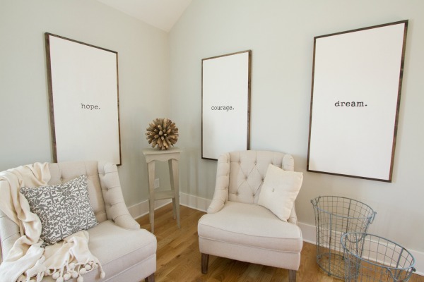
Besides the table, my favorite was the Word Art. Simple and could be made any size to fill those large walls.
Have you noticed how all of the rooms aren’t so matchy – matchy? This not only gives your home a collected look, but is a great way to use so much of what you have. Maybe an old dresser could be painted then used in the entry, or pick up a few accessories at a flea market. And the finishes of hardware are also mixed, although you are seeing more brass in homes now. It’s not the bright and shiny, but almost an antique look – making me wish I still had all of the brass I bought back in the 80s. Yes, keep your stuff and it will come back in style again.
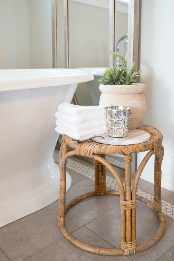
A piece I could see finding at a flea market is the rattan side table from the Master Bathroom, also designed by Refresh Home.
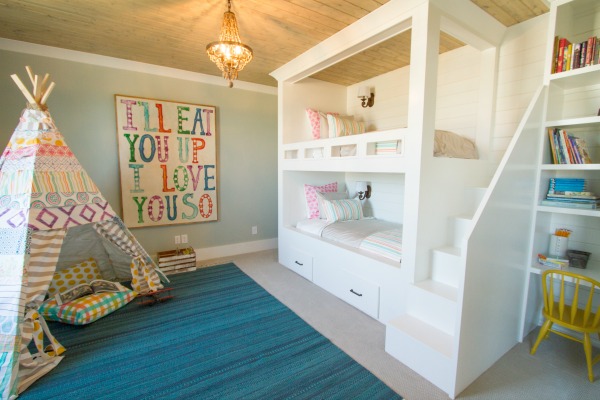
This children’s play room by The Handmade Home could easily be used as an extra bedroom. Don’t you love the built in bunk beds? What a great idea as a reading nook if you don’t spend all the time in the teepee.
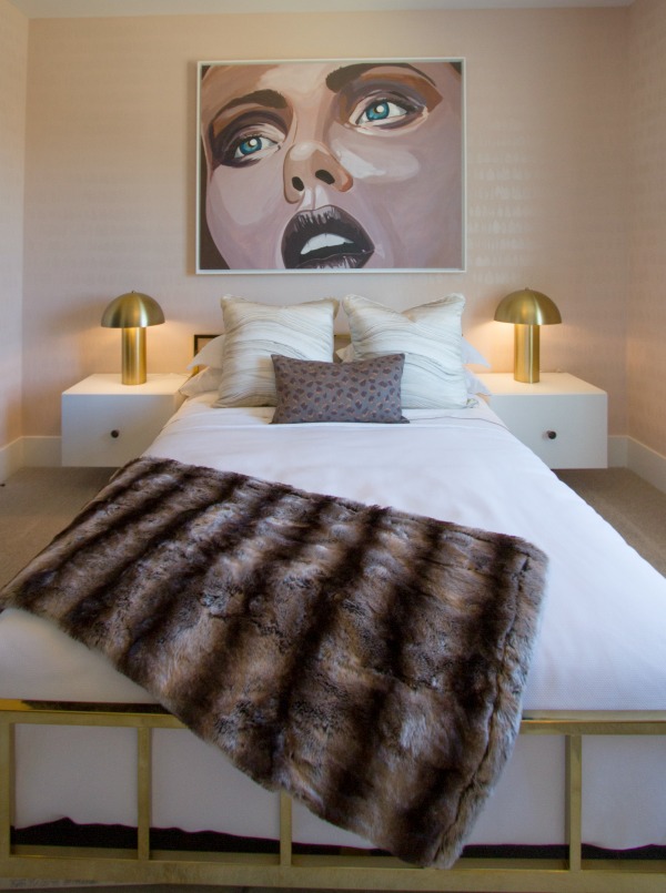
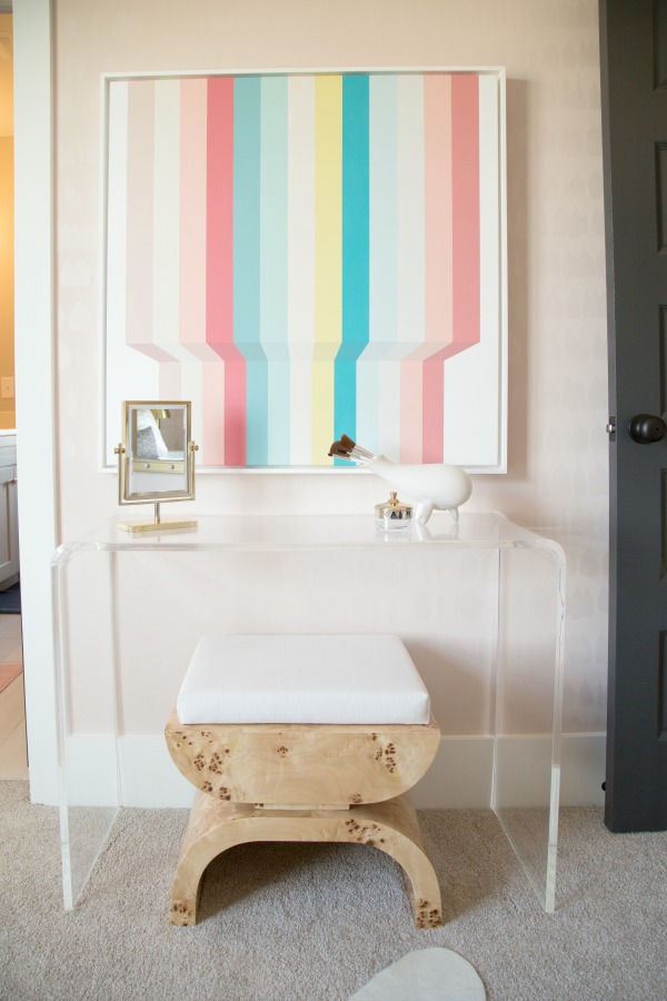
Then let’s not forget the teens. Gina Julian used artwork to bring a statement in this room.
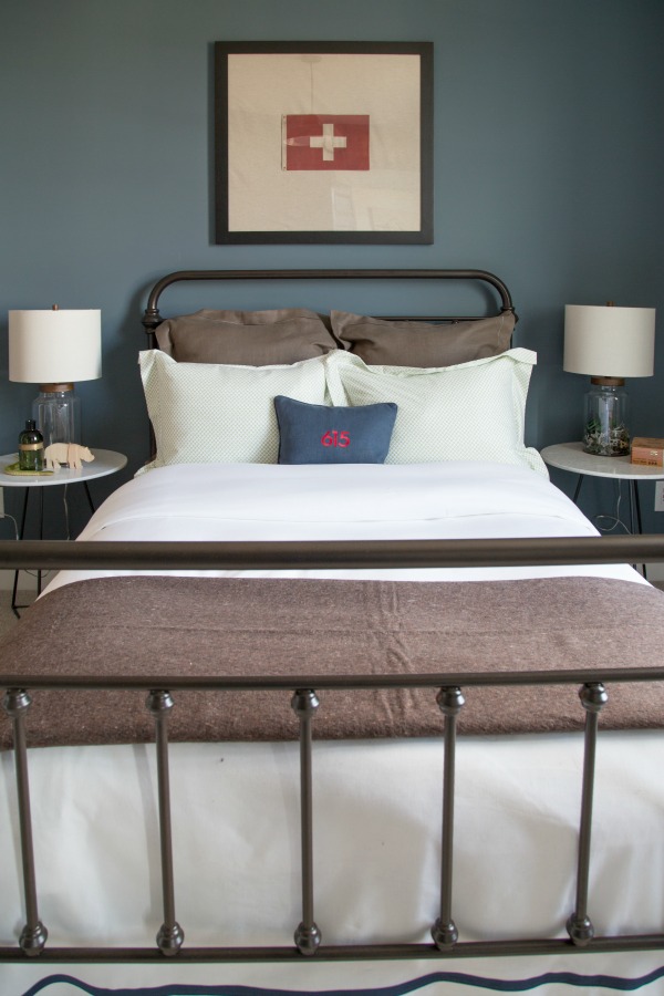
The boys room by Amanda Carlson Interiors could grow from child through the teen years. Maybe the bed could be a family treasure.
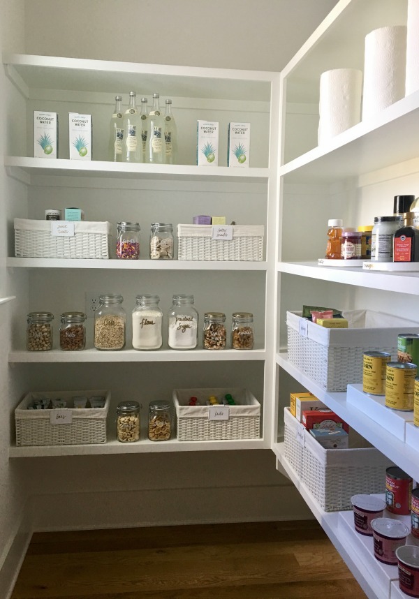
The pantry by The Home Edit would be the envy of the neighborhood.
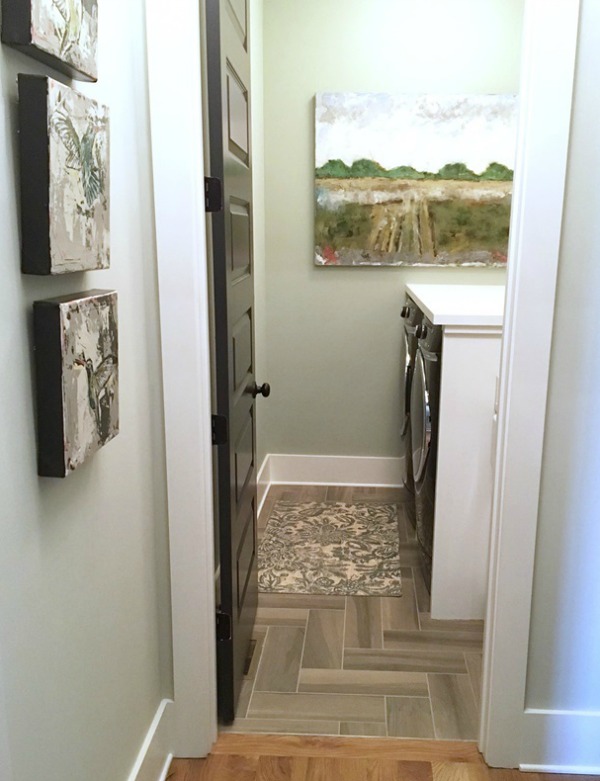
You saw a sneak peak at the laundry/mud room by Southern Hospitality, but here’s another view. Did you notice the art work?
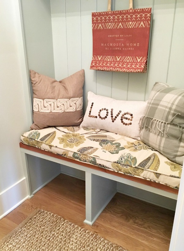
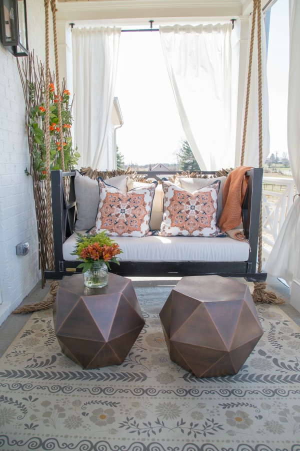
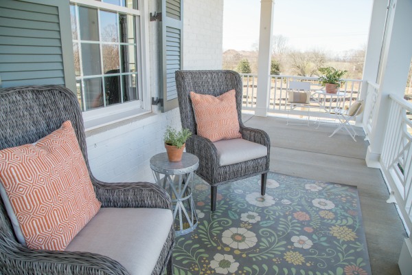
What would a farmhouse be without a covered porch? And upstairs by J & K Design Studios and downstairs off the living room by Redo Home & Design. So much entertaining space. Although it was a bit cool and windy the day of my visit, I could just see enjoying a morning cup of coffee or an evening with friends with your favorite wine.
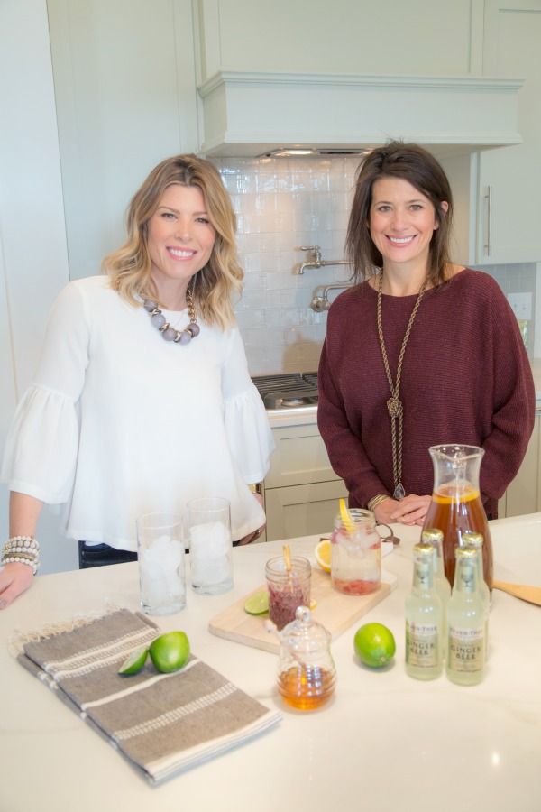
Of course some of the best part of attending events is the food and drink provided. A signature cocktail made by Landyn of Living with Landyn, was inspired from the name of the community, Southern Preserve. I believe it had a base of black current preserves. Tasty for sure. I think Lucy was her taste tester, and approved.
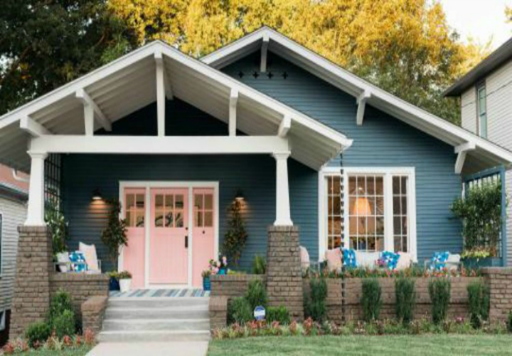
As noted from my previous post House For Hope was built by Carbine & Associates and decorated and styled by fifteen talented stylemakers & influencers from around the South.
You still have time to visit House For Hope to gather your own inspirations and raise money for children’s charities of Middle Tennessee.
The House For Hope Designer Show House is open daily March 4-12 from noon to 5:00 p.m. in Southern Preserve neighborhood, 2045 Lewisburg Pike, Franklin, TN 37064. Tickets are $15 per person.
Thank you to Geinger Hill for her talented photography talents.
I would also like to encourage you to visit the websites of each of these stylemakers to see all the other fabulousness (is that a word) they do on a daily basis.
What was your favorite? Too many to choose from? I hope you are Getting Inspired from The House For Hope
I’ve included affiliate links to Amazon for you to find some products easier. I may receive a small commission, but the price is the same for you. It just helps my blog out.
Happy Travels,
Rosemary





What a beautiful home! Thnks for sharing so many photos. I like that it looks likke you could adapt the decor of any room without breaking the bank!!