Touring the HGTV Urban Oasis 2017 Home
I had the pleasure of touring the HGTV Urban Oasis 2017 Home in Knoxville recently. And guess what???? You can enter NOW to win this beauty HERE! You asked for pictures so this is loaded with them.
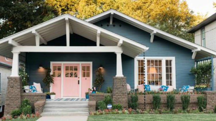
A fun perk of my job is being given the opportunity such as this. As I was Touring the HGTV Urban Oasis 2017 Home, it was great to meet up with other blogging friends and influencers, plus meeting new friends. We also got to meet the architects, Sean and Sara Martin of Open Door Architects. They were able to provide a little history to this craftsman style home, why and the construction of the rooms were done, and working with Brian went hand in hand.

Meeting the home designer, Brian Patrick Flynn, was also another highlight. I’ve always enjoyed seeing his designs on many of the HGTV shows he’s been featured on. There’s so many innovative designs in this HGTV Urban Oasis House, but it’s turn key ready for the winner. Did you click the link above to enter?
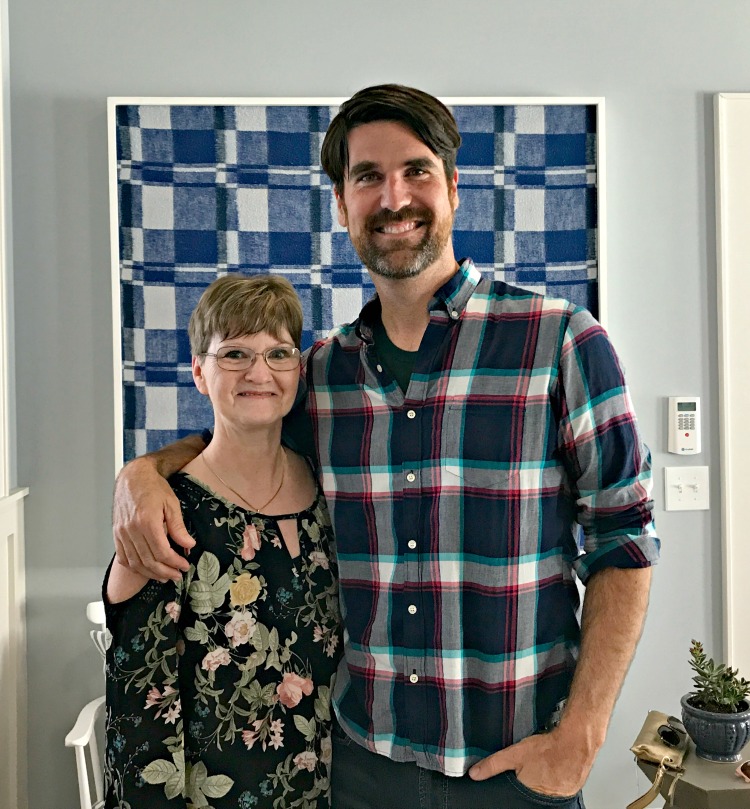
Brian has purchased a home in Iceland, which is on my bucket list to travel to. Watch for a re-run of House Hunters International to see this.
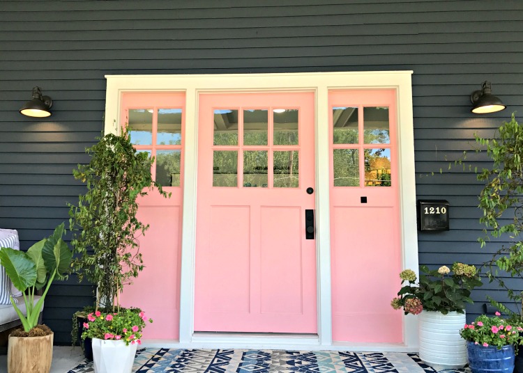
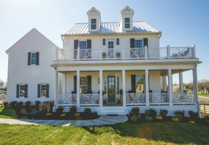
Do you want to make your curb appeal memorable? Or make a statement that the people living here are just fun? Your front door and color is the way to do it and by all means this one stands out. These Millenial Pink doors against the exterior and white trim makes a statement. And I love them.
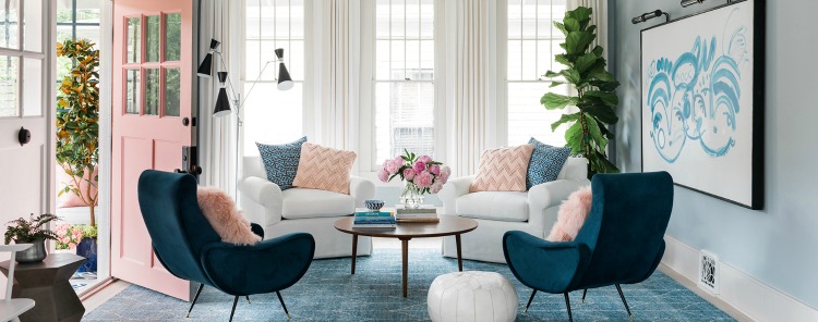
Going into the home, it’s a very open area. Many of the older Craftsman styles were very chopped up with small rooms but in this era of Open Concept, taking down walls is usually done if possible. Or not too expensive. It just expands the space from room to room and allows more family interaction.
Don’t you love the chair selection? No couch or TV – this was done with the intention of encouraging more talking and conversation.
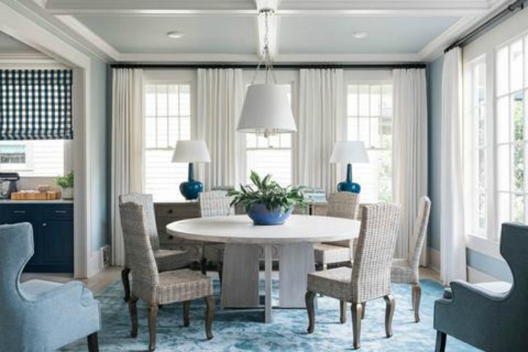
The round dining room table fits great in this space to add more seating if needed but with it too, the flow from the living room into the dining room, then the kitchen is effortless.
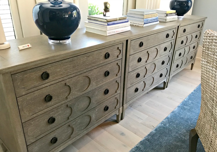
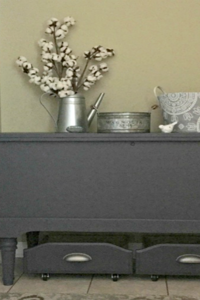
Storage is always an issue in no matter what size home. Instead of a typical china cabinet or sideboard, I love using these three chests in this space for any of your tablecloths, napkins and extra serving pieces. Since they are low, it still allows all the natural light to come in.
Can we just swoon a minute over the ceilings in these two rooms?
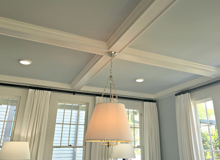
To keep the airiness and open feeling of the room was done by using white for the shades on all of the light fixtures and drapes. The soft blue from the living and dining room is getting you ready for that blue kitchen.
Now this kitchen. WOW – the Benjamin Moore Van Deusen Blue on the cabinets made me want to go home and paint mine. And yes, it’s still in consideration. I’m thinking navy blue is the new black in the decorating world. Blue and white though is and always be a classic color you can’t go wrong with.
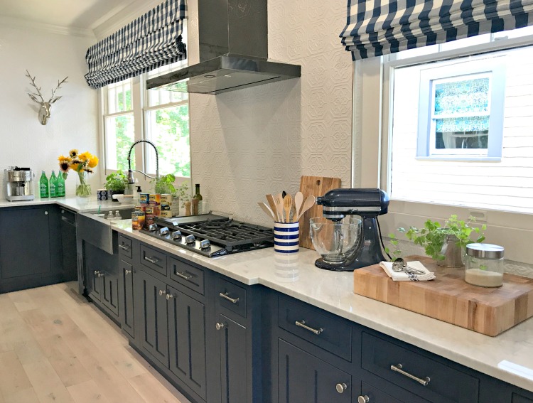
The portion of the kitchen was expanded from another room and the brick was exposed. By painting it, and adding these metal tiles, it kept with the craftsman feel of the home, but yet with other touches, made it modern and ready for the next generation to live in.
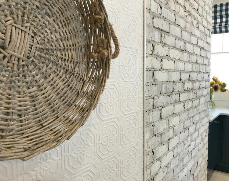
Brian, as most anyone does, usually uses odd numbers for accessories, but when he saw these two rattan lights, he knew they were just right for this space. They are large, but don’t over power the space. And with them being hung just a bit higher than normal chandeliers, your guests can still sit at the island and be able to see around the kitchen. Or the chef at work.
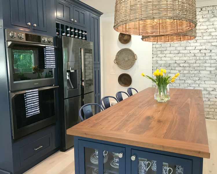
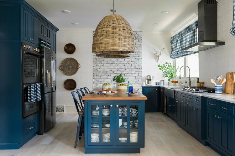
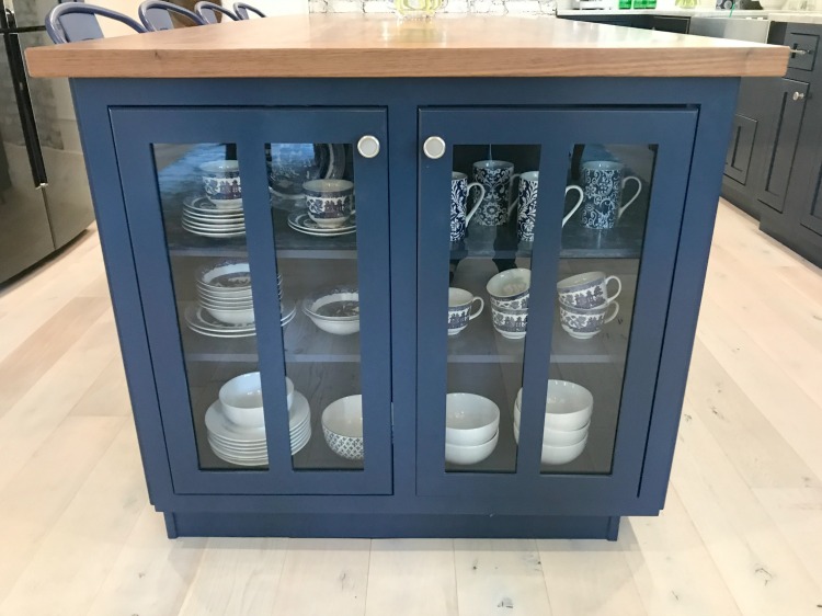
Again for storage and looks, on each end of the island are built ins and with the glass, you can highlight your favorite blue and white pieces.
There’s always something to catch your eye as you walk to another area of the home.
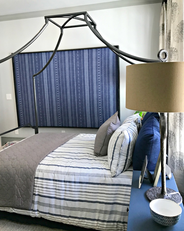
The blues are carried into the guest room. Again a non-traditional piece of furniture is used in place of a chest and the dramatic wall art.
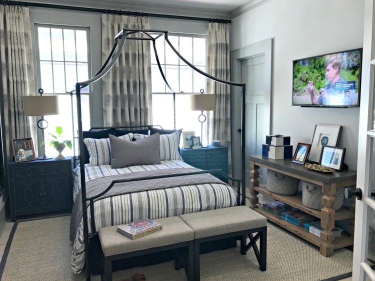
A little inside secret about this art. It is a duvet which came in and was too small to be used. So what do you do – stretch it over canvas and make art. Such clever ideas you can incorporate into your home too. Any piece of fabric could be used for this.
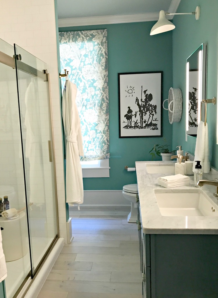
And what guest wouldn’t love this bathroom?
The teen room makes great use of the space with the built in bunk beds.
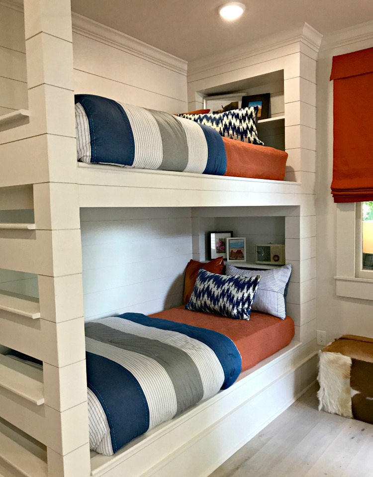
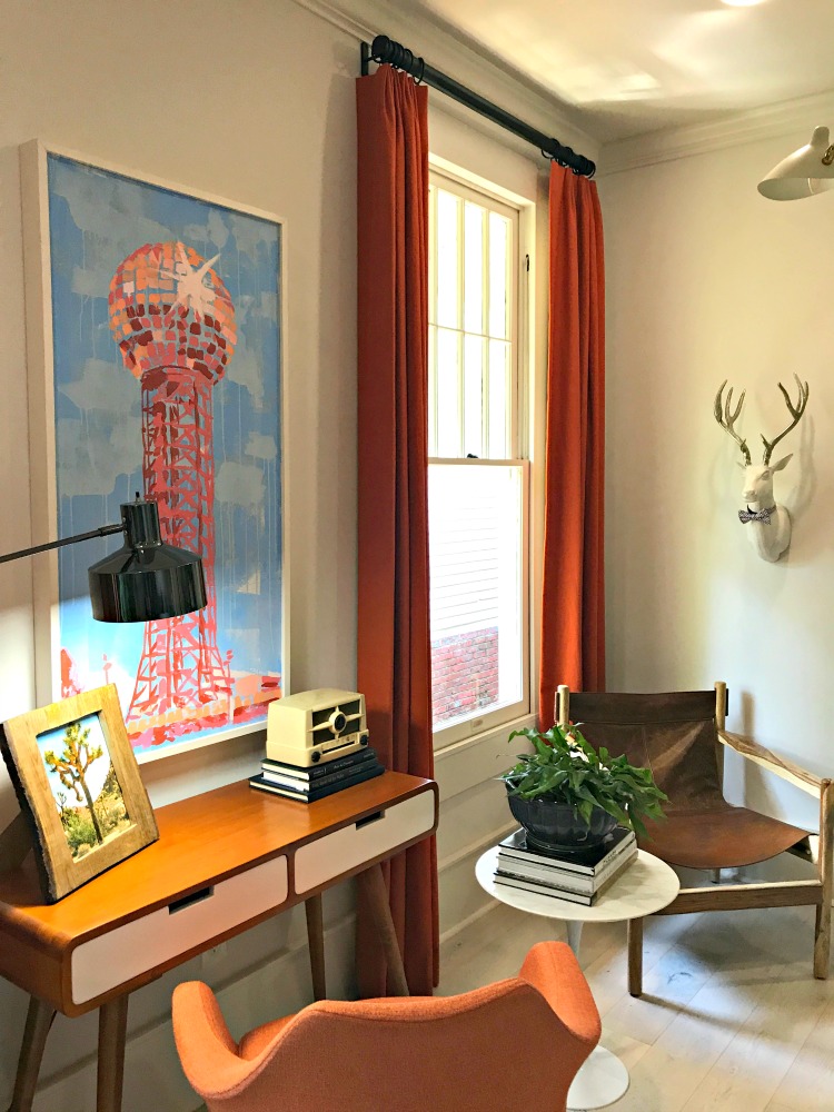
You will notice a nod to Knoxville in the artwork.
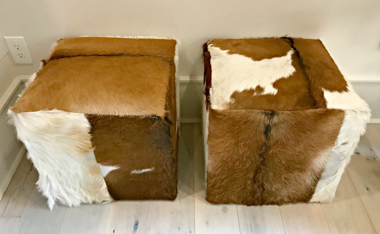
And for those times you need some extra seating – faux cowhide ottomans. LOVE!
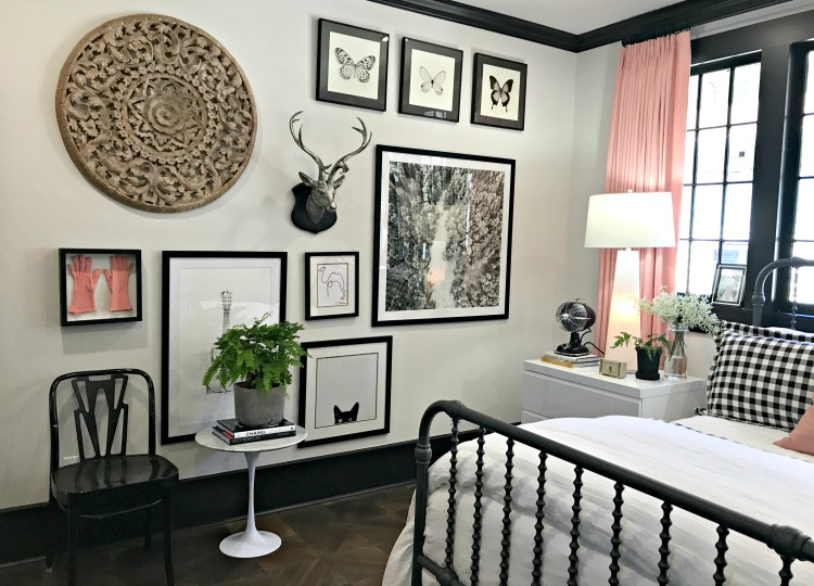
Now to the Master Bedroom – you first notice the Millenial Pink used in drapes but this time is paired with black.
A floor to ceiling gallery wall is the perfect place for personal items or photos of travel. Maybe the pink gloves were from prom of your Mother.
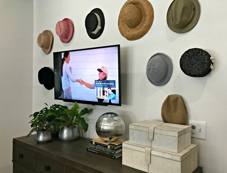
Another gallery wall over the dresser showcases a collection of hats. These could easily be found at most flea markets if you need to add to your collection.
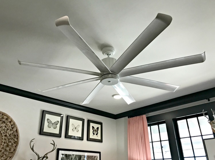
Some think ceiling fans are not as dramatic as a chandelier, but this one is. Remember you are in the South, and ceiling fans are almost required in your home.
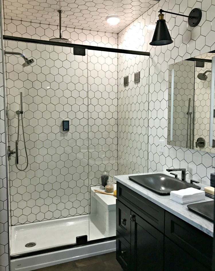
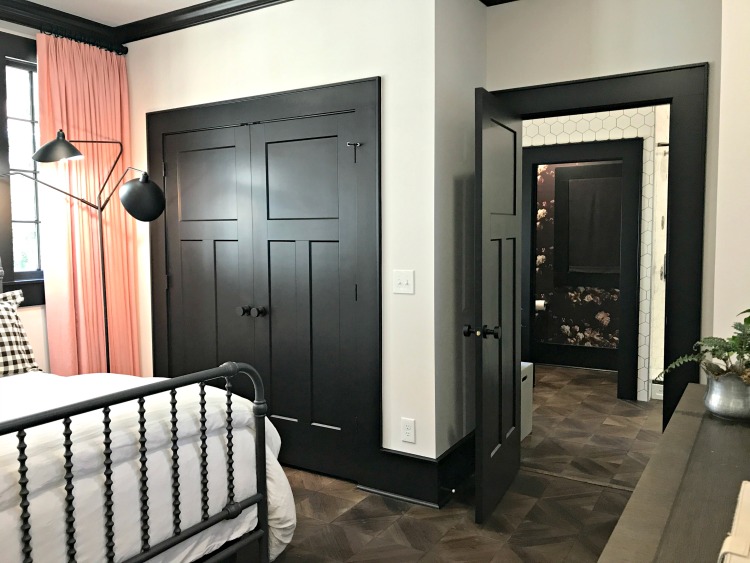
The black trim leads into the fully tiled master bathroom. The classic hexagon shape will never go out of style. And there’s a peek at the wallpaper used in the water closet. You know wallpaper is coming back in style.
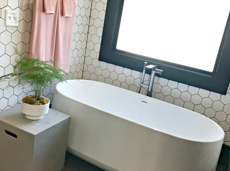
A simple cube side table and a few pink towels are all you need against this free-standing soaker tub.
You can see, I’m just giving you a few of my favorite things but you can find many more ideas and how the house was renovated and designed on the HGTV Urban Oasis site.
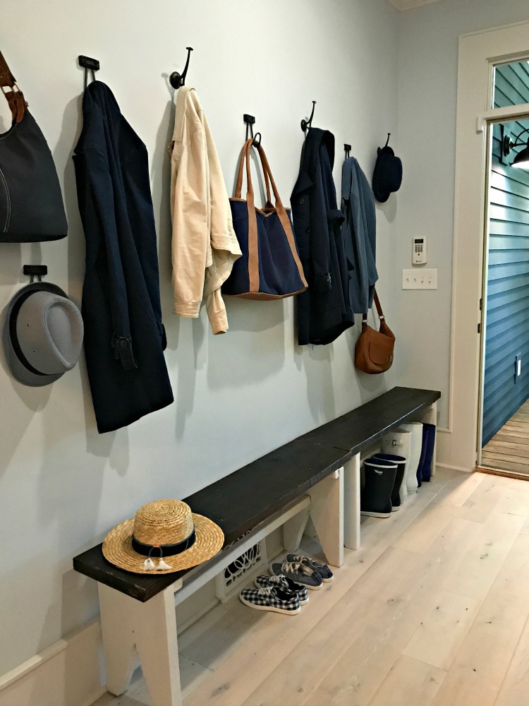
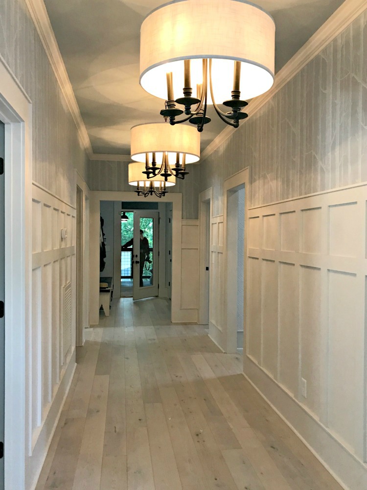
This home was actually a duplex before the renovation and there was a door at the end of this hall. Taking the door out and expanding the hall leads through the landing area of the home for all of your jackets and bags as you come into the home from the back entry.
This new hall leads to one of my favorite areas (well, it’s hard to choose my real favorite), the screened in back porch. The batten board added to the wide hallway is a great architectural detail which could easily be done by most anyone with just a little woodworking skill.
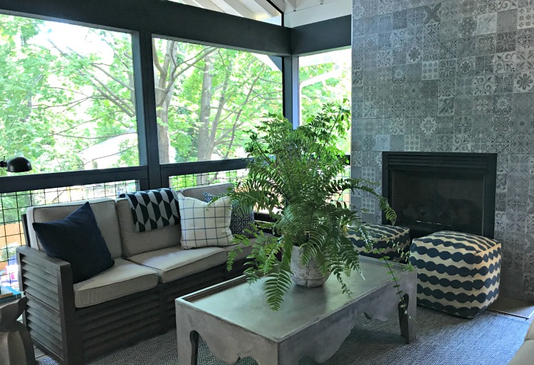
A ceiling fan for those warm days and a fireplace for the cool ones. I’m not sure I like it more for extra entertaining space, for for my own little haven to sit with my coffee and a book.
Now to all of the outdoor areas. Talk about making use of space.
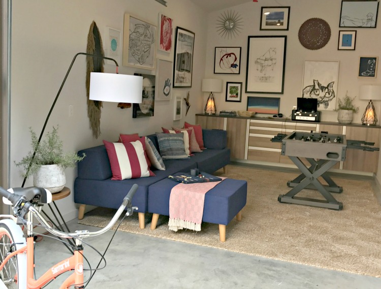
The garage is a great hang out area.
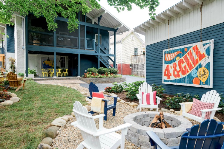
The fire pit and seating area is great to invite the neighbors over to enjoy a cup of coffee or a glass of wine. You can probably even hear the roar from Neyland Stadium on game days. The 4th & Gill area is a small neighborhood just waiting for the winner of this home to move in.
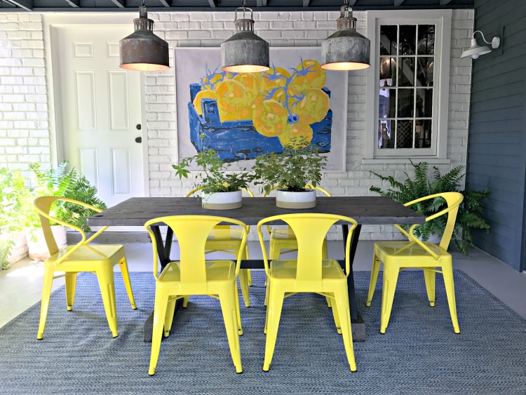
And under the porch, another dining area.
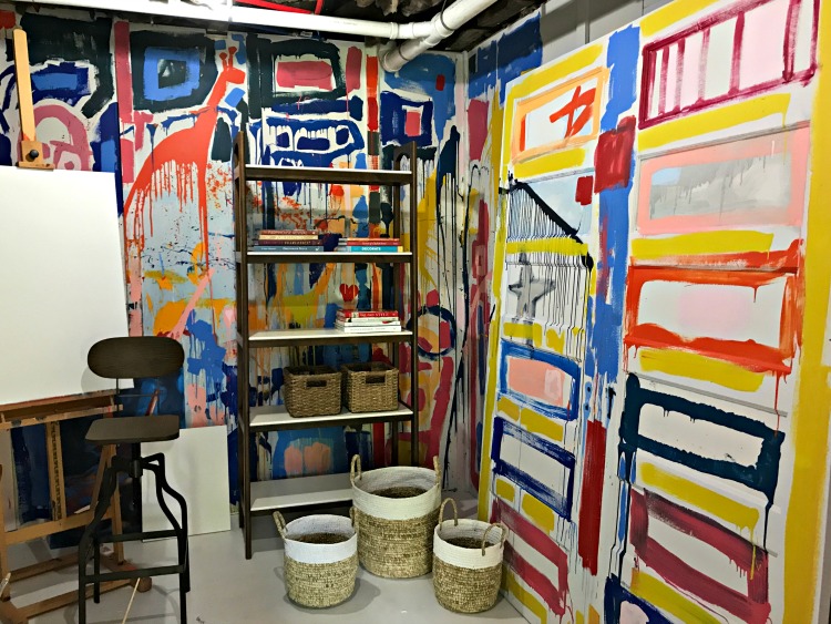
Often left for just storage, there’s now an artist studio for creating a masterpiece.
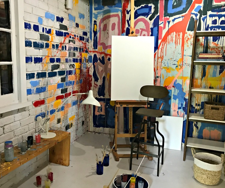
Now that you have seen all of these #HGTVURBANOASIS2017 pictures, aren’t you ready to register to win it? I am.
Oh, wait – win the house and you also get this.

Photos © 2017 Scripps Networks, LLC. Some photos used with permission; all rights reserved.
You can find more details, rules and all that legal stuff on the HGTV URBAN OASIS website. Plus more pictures if you didn’t see enough.
Now enter twice a day until November 22, 2017 5:00 PM EST. If you win, will you invite me over? I’ll cook for you.
I’ve included affiliate links to Amazon for you to find some products easier. I may receive a small commission, but the price is the same for you. It just helps my blog out.
Happy Travels,
Rosemary






haha I literally JUST entered today’s entry. Love this post! Good luck to everyone (but more to me lol)
Oh wow, I am impressed with this home. It’s so gorgeous. And clean. My home is never that clean. I will register to win! Just in case 😉
The home is so beautiful and well kept. My favourite is the pink door and the bunk bed. Everything is gorgeous in there.
Congrats on getting to tour the Urban Oasis House. It looks amazing in the pictures so I can imagine in person!
Now this had to be an enjoyable tour. Your pictures captures a lot however I am sure this was a breathtaking experience.
Pictures looks really amazing and the house looks gorgeous , Congrats on getting to tour 🙂 Thanks for sharing!
What an awesome opportunity, to see a beautiful house. I WANT it myself. I love your pictures and how you included fantastic views of the entire place (and team) not just a few that would likely also be shared on social media and magazines. So beautiful. Registering to win it… NOW.
Oh my goodness that house is gorgeous! I love that little living room area just through the front door! I’ve not heard of the Urban Oasis before but I’ll have to check it out!
Any idea who the artist is that painted the Knoxville Sunsphere piece?
I don’t but I’m contacting a few who might. Will keep you posted.